
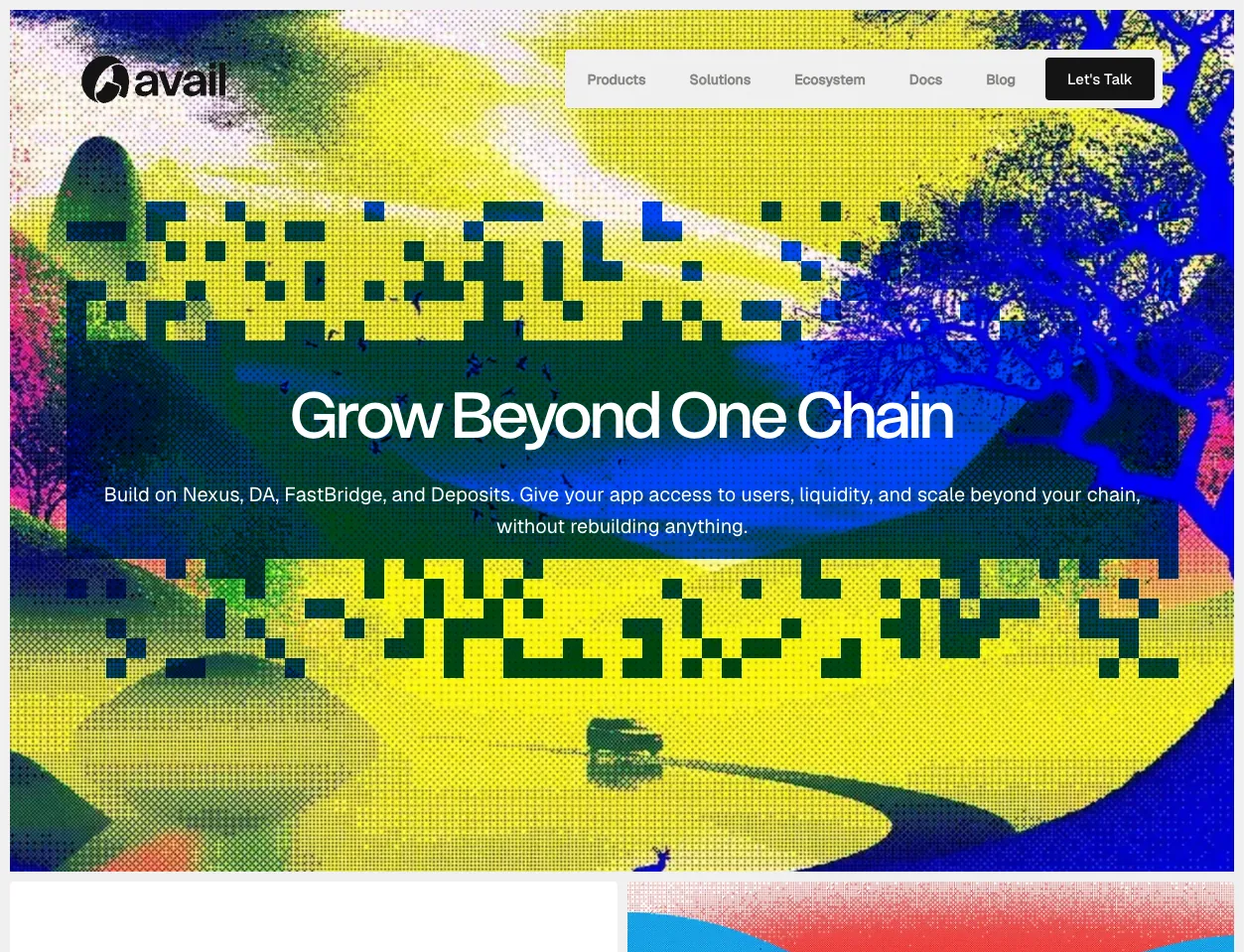
A comprehensive UX overhaul for Avail’s ecosystem of products, focused on simplifying the complexity of modular blockchain interactions for everyday users.
What it is. A design engagement covering the Avail ecosystem’s public face: the main website and the surrounding product surfaces. Modular blockchain technology carries a heavy explanation burden — data availability, light clients, validity proofs — and most of it lands on the user. This project reduced that burden by design rather than by documentation: fewer terms, clearer hierarchy, interfaces that show state instead of describing it.
The challenge. Avail’s products speak to two audiences at once: infrastructure engineers who live in the detail, and builders who just need to know if their chain is safe. A single screen often has to serve both. The redesign established a system of progressive disclosure — the essential answer first, the depth one click deeper — so neither audience is stuck reading the other’s vocabulary.
What was delivered. A refreshed design system: type, colour, spacing, and a component library reused across the ecosystem’s sites. Redesigned core pages with a clearer narrative structure — what Avail is, why it matters, and where to start — and interaction patterns that keep dense technical content readable.
A concrete use case. A developer evaluating Avail for a new rollup lands on the site. Within one screen they see what Avail does and the proof that it works; within two clicks they’re in the documentation or the explorer, depending on what they need. Before the redesign, that journey ran through jargon-heavy sections that lost a measurable share of visitors before they reached anything actionable.
Why it matters. Web3 projects compete on technology and lose users on clarity. A coherent design system across an ecosystem of products is what makes a complex network feel like one trustworthy product rather than a collection of whitepapers.
Explore the result at availproject.org.
